Tips On Choosing The Right Font For Your Brand
Although your font selection might not grab attention in the way a logo or brand does, it still makes a massive impact.
Your font is the subtle element that glues your design together. Fonts give meaning to the content of a site and create a sense of authenticity.
They present a context to information shared and add personality to a design. So whether you are designing in print or online, consider your typeface carefully. A good choice will engage your audience and offer a sense of congruence to a site.
If you’ve already decided on a logo font, you might have selected a font which suits the style or mood of your design.
This will help you to establish the feel of your page. Now it’s time to select a strong secondary font. You’ll also need a legible body font for your copy or text.
Selecting a font for your design might feel overwhelming at times. There are a great many different options available and it can be hard to settle on a limited choice. The following guidelines are here to assist you:
#1. Focus On Practicality
Ask yourself which font will be most practical for your design? Each font will offer its own voice. Instead of exploring each font for the mood it offers up, search for how adjustable it is.
A font which will stand out in a range of settings is an excellent choice. Likewise, search for reliability.

A typeface which can be used in a variety of different weights will give you a great many ways to use it. These fonts make great options for your design.
#2. Look At Legibility
A creative font can appear to be very attractive but if your viewers cannot read it, it will lose its purpose. To check for legibility, ensure each letter is easy to distinguish when displayed against others.
If you aren’t able to read your fonts easily, rather make a different selection. This will give your brand life while keeping it legible too.
#3. Do You Want Your Fonts to Correspond or Contrast?
When you’re creating a design you can select your fonts to correspond or contrast. Think of a heritage site with traditional fonts. Or imagine a modern site with clean-lined, very precise fonts.
These fonts correspond with one another and create a mood or feel. However contrasting fonts can be used to play off one another.
Think of a shop with redesigned vintage clothing. Playing with fonts will give a unique feel to the design.

When working with a font you don’t want your viewers to pay attention to the lettering as much as the mood the lettering creates.
If your fonts are similar your viewers might spend time trying to work out if they are the same. However, effectively contrasting or corresponding your fonts will help deliver a clear message about your brand and create atmosphere.
#4. Using Fonts for Branding
When you use fonts for branding, the font will send your client a message. Think of the colourful, playful tone of the Disney font, the clean-lined and very defined CK brand or the sense of authority behind lettering in The New York Times.
Font selection has a very powerful impact on the way that viewers send and receive messages.
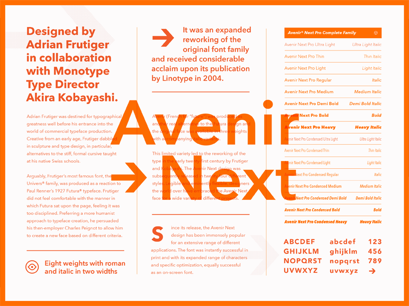
Serif fonts
Serif fonts represent classic typeface. A serif is a small line or flourish which occurs at the end of each letter, and is a popular element in both traditional typeface and New Times Roman, one of the favourite typeface settings used in word processing documents.
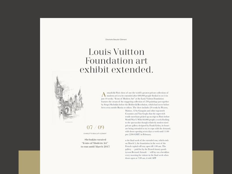
Serif fonts are a great choice for print media. They are often used in books and magazines and brochures and as a result, are have become very familiar. They are often considered to be sophisticated, classy and trustworthy.
Sans Serifs
Fonts sans (or without) serifs are clean-lined and fresh. These fonts give a modern feeling to a design and are often used in an online format.
They are great to read at lower resolutions which makes them great for websites or e-publications. These fonts can often be used at different weights, which will impact on the feeling they bring.
Bold fonts are considered to be strong and hardworking, while thin fonts are considered to be elegant and add a touch of glamour to a design.
Slab fonts
Slab fonts are thick and robust. These fonts have neutral shapes and bold styles. These fonts often combine both traditional and modern elements.
They are used to create an impact. They bring a slightly nerdy element to a design and are used for headlines rather than in text.
Script fonts
Script fonts imitate cursive handwriting. They often bring a sophisticated and unique feel to a design or brand. There are a wide variety of different script fonts available.
Some might resemble the calligraphic writing on graduation certificates or wedding invitations. Others are simple and down to earth, giving the appearance of everyday handwriting.
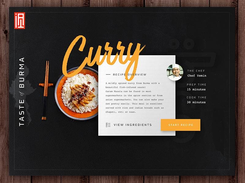
These fonts are often elegant and add a feminine touch to a design. They are most often used in headings rather than in body text.
#5. What Would You Like Yur Brand to Portray?
When selecting a font for your brand, ask yourself what you would like your brand to portray? What does your brand highlight?
If your brand highlights intellectual freedom, then a slightly nerdy slab font would be a great option.
However, if your brand focuses on glamour or sophistication, you would make a very different selection. Explore the message you would like to communicate using a font.
Once you’ve worked out your message consider your target market. Do you have a ‘persona’ or set person you are marketing to?
Think of the age of your clients. What are their hopes, dreams or fears? All these factors will assist you with putting together a design.
#6. Combine Your Font with Your Brand’s Character
Once you’ve worked out your brand identity and your target audience, it’s time to align your font with this identity.
The slightly intellectual feel of a coffee shop aimed at young freelancers would benefit from a slab font.
While a technology company who focuses on up to date scientific data may benefit from a geometric font.
When you select your font, look at the character it represents and aligns this carefully with your brand identity. This way you’ll be sending out a congruent message to your reader.
Once you’ve selected your font, check for readability. You’ll want to create a great first impression for your reader and this often means picking a font which is both aesthetically correct and practical.
Once you’ve got this combination right, you’ll have a font which is able to show your brand’s identity.
#7. Maintain Your Balance
Once you’ve selected the font for your log design, consider how much personality it has. If your font uses hand lettering or is very dramatic, use it sparingly. This will prevent your reader from becoming overwhelmed.
A display font will add a great deal of interest to your page. Like a dash of neon colour or a touch of spice in a recipe, it brings zest and interest.
However, you would want to contrast a bold and exciting font with a more subdued body text in order to keep your page balanced.
#8. Take A Reflexive Approach
Once you’ve finished your design, take a reflexive approach. Explore whether your font communicates the image you would like for your brand.
What does it say now that the work has all been put together? When your users see your logo or brand, will they understand what it is that your brand represents?
It is always possible to create changes to your font or design before releasing it. It can be harder to make changes when clients have already identified with a brand.
The New York Times, for example, used a traditional (but not old-fashioned) font as their newspaper headline for a long time. However, they adjusted this font in 2013 to represent an era of technological advancement.
Customers protested loudly at the change in appearance. This is because brands are associated with a certain font and the message this contains.
Summary
Now that you have an understanding of how fonts are connected to brand identity, it will be easier for you to put together a design which will speak to your audience.
This will enhance the identity of your brand. Once you’ve created a design, you’ll be able to write up a style guide so that the brand stays consistent.
About the Author!
Bogdan is a designer and editor at DesignYourWay. He’s reading design books the same way a hamster eats carrots, and talks all the time about trends, best practices and design principles.